


Calendar
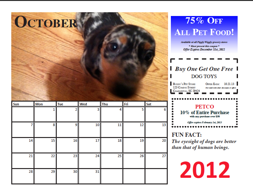
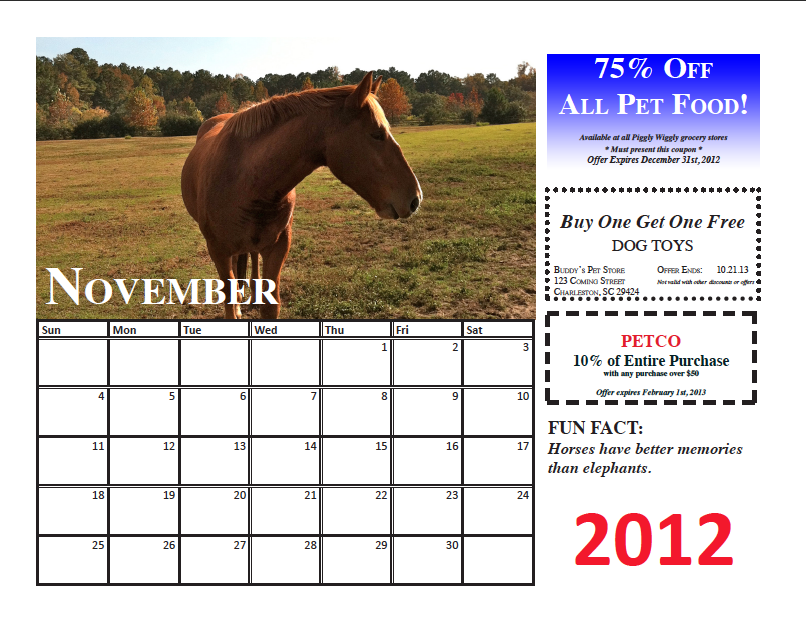
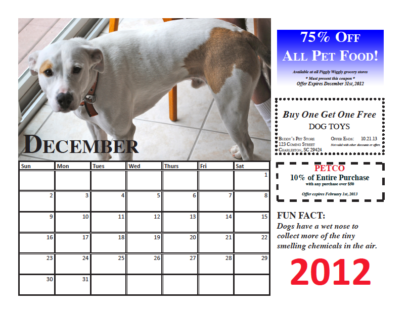
Upon completing the calendar assignment, I realized I made specific choices that followed the CRAP principles (contrast, repetition, alignment and proximity). For the best contrast and readability, I decided to use a black, bolded, all caps font for the months October and December and the same for November but in white. I put the year 2012 in bold and red so it stood out and in the same font as the dates on the calendar. I italicized my fun facts so that it stood out from the coupons. I used the same two fonts (Times and Calibri) for repetition throughout the calendar. All of the headers, coupons, and fun facts are on the same place on every month. The proximity of the coupons was important so that it didn't look scattered and random on each page. The month names on the pictures are aligned, however the month of October is at the top of the photo for readability. For the coupons I took artistic license and gave them borders so that it looked more "coupon-like" and believable.